| Table of Contents |
|---|
Introduction
This is the first version of the DQ density report per registry that WMDA provides. We plan to collect collected comments till 31 Jan , and will then provide provided the improvement plan.
The reports are now improved and released as official report from onward. Reports are sent out on the 15th of each month to aal Data Uploaders and to all members listed as 'Dataquality Report Recipient' in our CRM. If you want to have this role added to your profile in our CRM, send a request to: mail@wmda.info.
Below is the explanation of the report:.
Overview of report
Below is an example report for CBU. The donor report will be similar, Only the "Data Distribution" part is different.

Report Explanation
Section | Report example and Explanation |
|---|---|
Header |
|
The report name and version. Extra |
features like:
| |
Header |
|
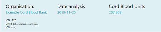
Identifying organisation name and ION, listing |
organisation name and ION if applicable, date that the report is generated. |
Data Summary |
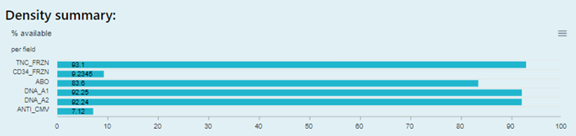
The fields density for a listing organisation. Only field with value will be listed. |
Data Distribution |
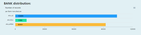
When the organisation is in charge of and uploading data for other CBBs and registries, then there will be the distribution bar chart. This bar chart provides the data distribution of the number of records of each organisation. | |
Charts for Focused |
fields |
|
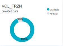
This pie chart provides a visual indication of |
what |
percentage of |
provided records has data |
available for that |
field. |
Charts for Focused |
fields |
|
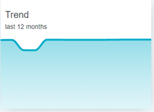
This line chart provides a trend analysis with the development of the % available data for that field for the given period. The trend is displayed RELATIVE. The global trend (the number of records provided over a period) can be found here |
. |
Charts for Focused |
fields |
|
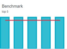
This combo chart provides a comparison of the density (%) available data from the top 5 global performers |
present in the WMDA international database. |
For the global development of the AVERAGE availability of data you may consult the global density trend analysis per field at https://statistics.wmda.info/density/ |
Qualitive
Qualitative Distribution per (focus) Field Detailed distribution per field |
|
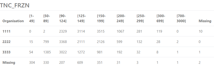
This table |
provides the CBU count distribution with value range of the specific field. The data ranges like “[90-124]” are the default data ranges that WMDA uses based on clinical |
requirements or community suggestions. |
The Organisation column shows the unique WMDA organisation id (WO-ID). “Missing” in the last row means some CBUs are provided without the WO-ID. “Missing” in the last column means no value has been provided for this field for that number of CBUs |
.
|