...
Section | Report example and Explanation |
|---|---|
Header | The report name and version. Extra features like:
|
Header |
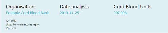
Identifying organisation name and ION, listing organisation name and ION if applicable, date that the report is generated. |
Data Summary |
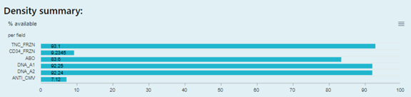
The fields density for a listing organisation. Only field with value will be listed. |
Data Distribution |
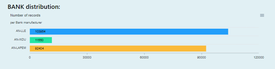
This bar chart provides the data distribution of the number of records of each organisation when the organisation is in charge of and uploading data for other CBBs and registries. |
Charts for Focused fields |
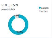
This pie chart provides a visual indication of what percentage of provided records has data available for that field. |
Charts for Focused fields |
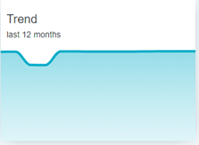
This line chart provides a trend analysis with the development of the % available data for that field for the given period. The trend is displayed RELATIVE. The global trend (the number of records provided over a period) can be found here. |
Charts for Focused fields |
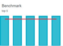
This combo chart provides a comparison of the density (%) available data from the top 5 global performers present in the WMDA international database. For the global development of the AVERAGE availability of data you may consult the global density trend analysis per field at https://statistics.wmda.info/density/ |
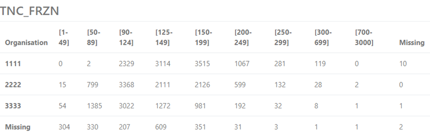
Qualitative Distribution for Focused Field |
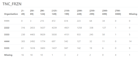
This table provides the CBU count distribution with value range of the specific field. The data ranges like “[90-124]” are the default data ranges that WMDA uses based on clinical requirements or community suggestions. The Organisation column shows the unique WMDA organisation id (WO-ID). “Missing” in the last row means some CBUs are provided without the WO-ID. “Missing” in the last column means no value has been provided for this field for that number of CBUs. |
...